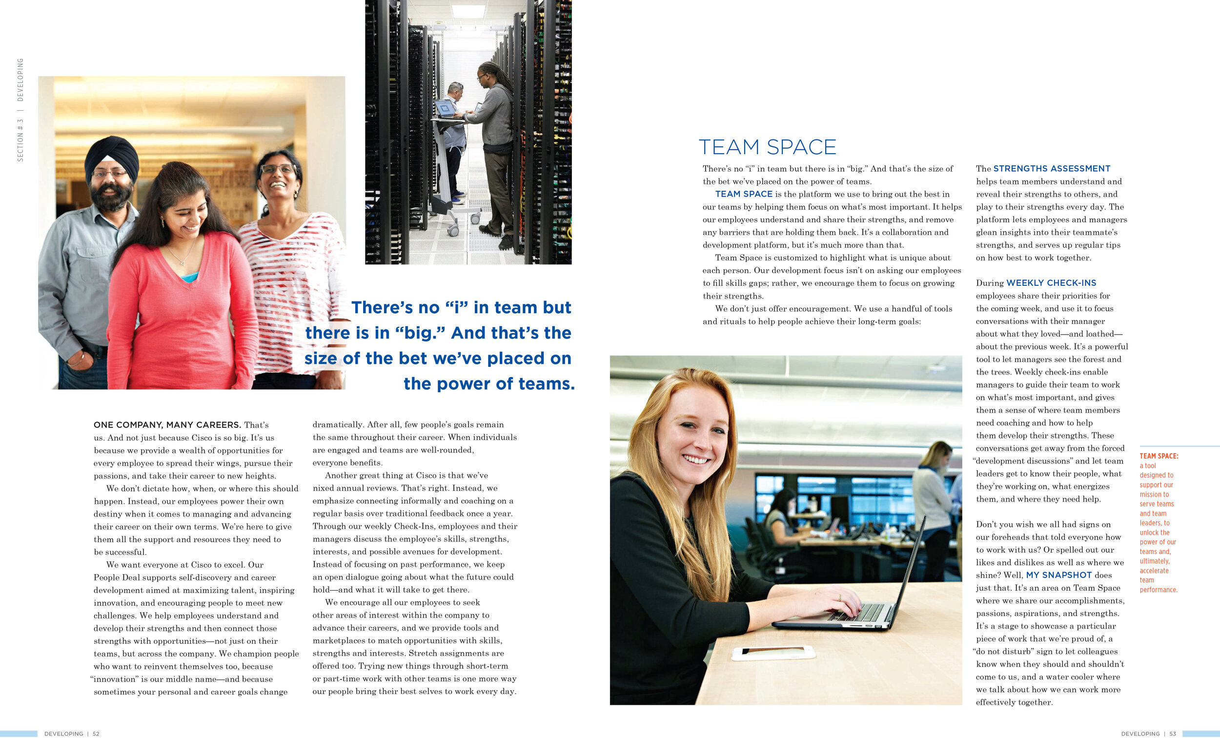
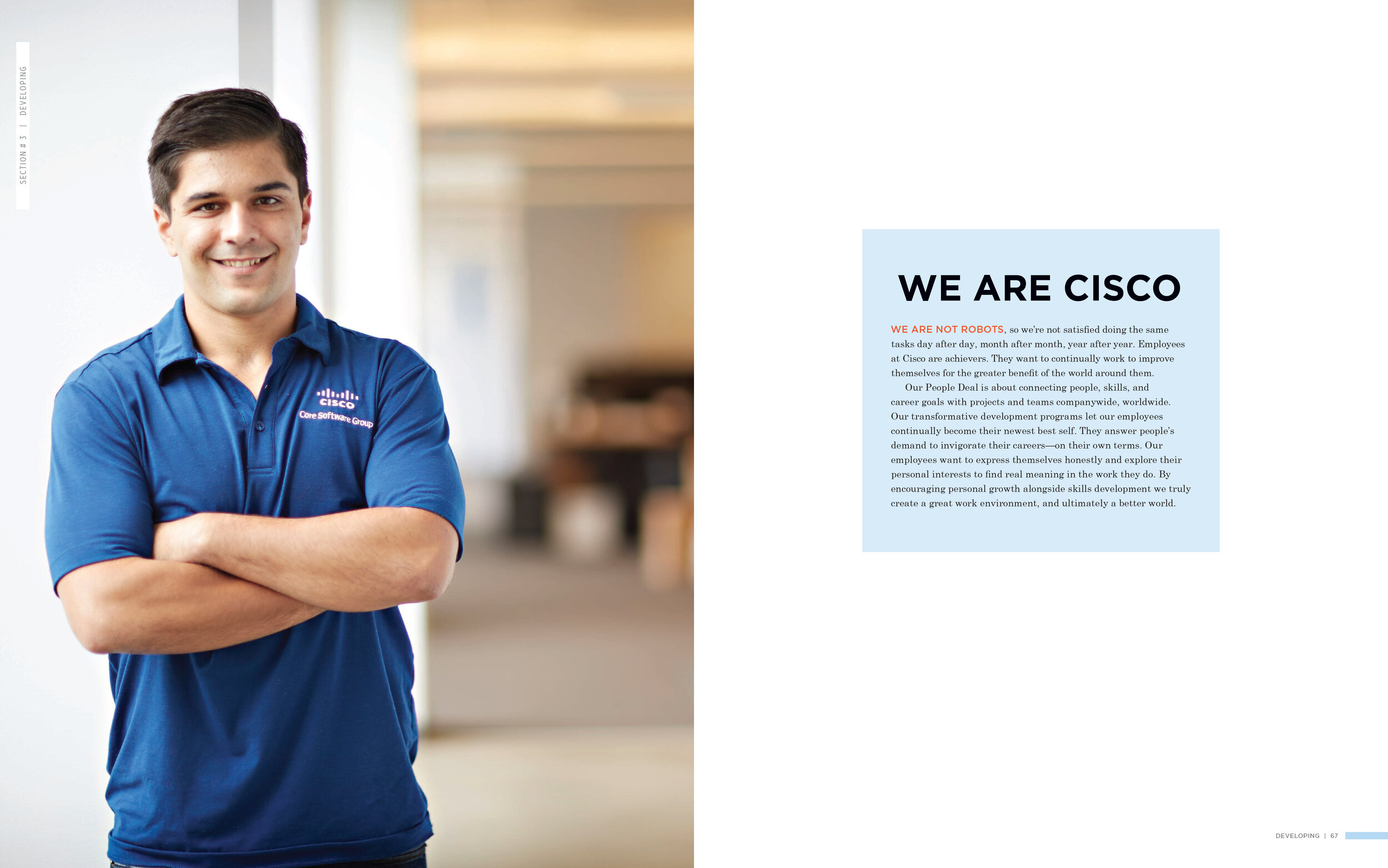
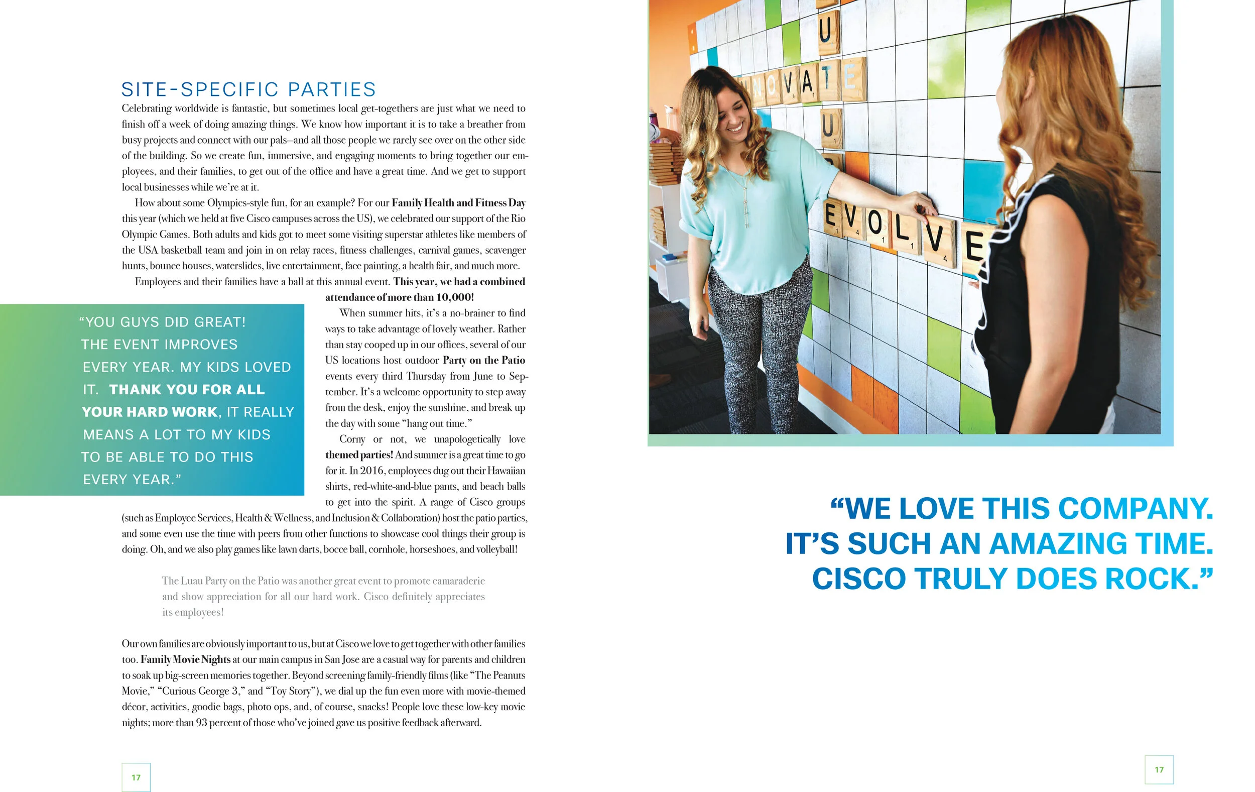
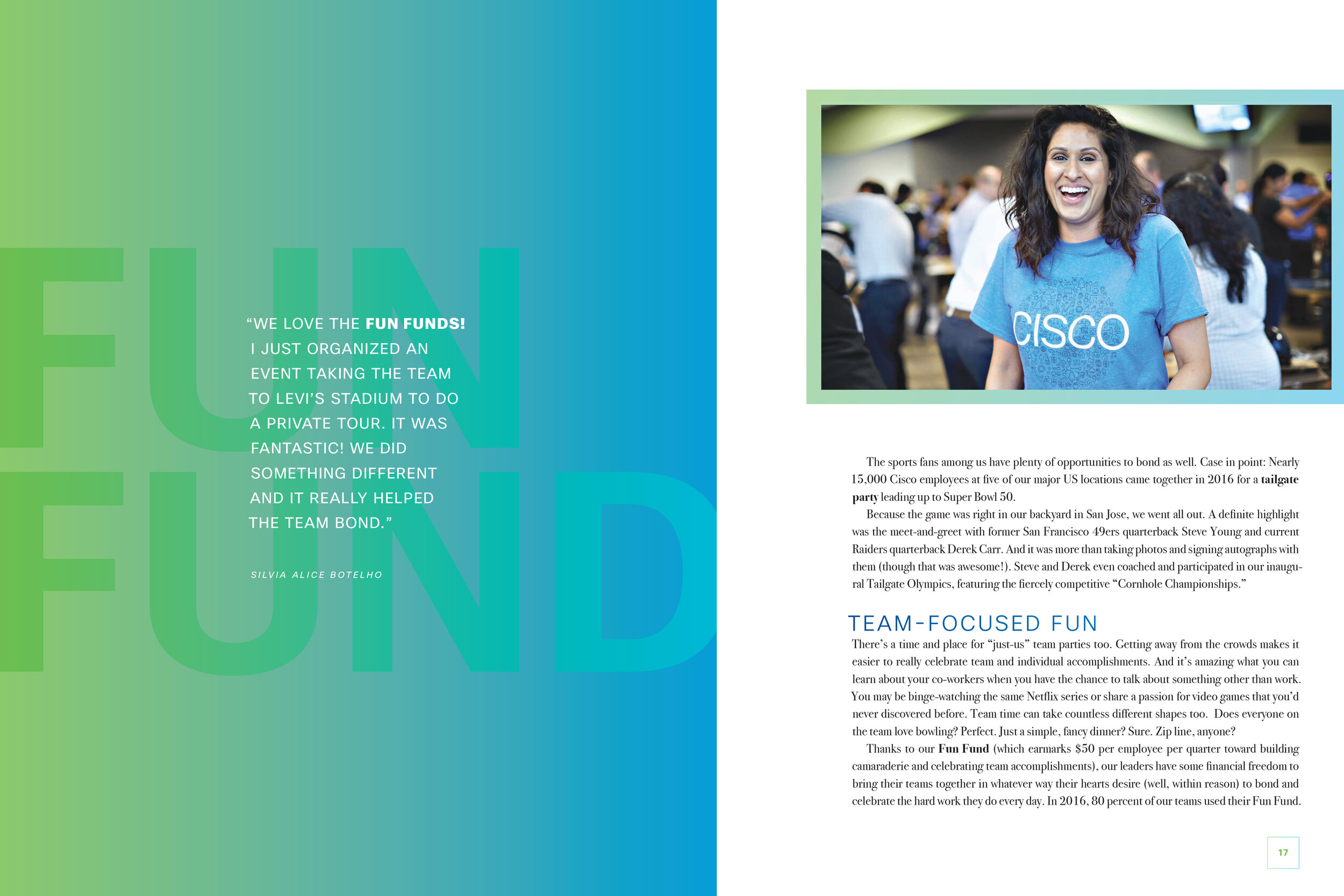
cisco culture book
Year after year, Cisco is consistently highly rated in Fortune’s 100 Best Companies to Work For. The Great Place to Work survey captures validated employee feedback on various topics, such as how a company cares for its employees, listens to employees, and works together in a collaborative culture. In 2018, Cisco decided to celebrate its culture as captured through the eyes of the employee survey in the Cisco Culture Book. Using material from both the Great Place to Work Survey (filled with many direct quotes from employees) and information about Cisco’s resources, services, and programs, The Culture Book is a celebration of what makes Cisco Cisco.

Stephen Powell (Cisco’s culture guru), Dajana Nedić (another MGD from NC State’s College of Design), and I developed the Cisco Culture book as a collaborative effort. Dajana and I approached the project from an iterative approach, creating early concepts for Stephen and working with him and other stakeholders to develop an overall aesthetic for the publication.


Concept One: Bold + Colorful
The first concept we presented featured bright and colorful gradients as highlights in text and as background to images. It offered large color photography, focusing on the people who create the culture of the company. Each section began with an introductory paragraph which we reduced down to a series of keywords to narrow the reader’s attention (placed directly under the chapter title). We implemented colorful navigational cues for both pages and sections, guiding the reader through the piece. We offered a variety of options for pull quotes and call out texts. If SAS chose this design, the book would feature color variation across its nine sections.


Concept Two: Clean + Sophisticated
This concept offered a clean, sophisticated, and professional feel. Perhaps the most traditional for the business aesthetic, concept two was designed for easy reading of a text-heavy publication. Each opening spread featured a black and white photograph, while all other pictures were in color. A delicate feature of this concept was the definitions of key programs written directly into the margins for quick reference. Two color palettes were presented, indicating how colors could transition for various chapters of the book.


Concept Three: Dynamic
The third concept was dynamic in nature, with areas of text and imagery moving dynamically throughout each page. This design was heavily populated with color photography of various sizes. Even with its less traditional, more fluid design, it stuck closer to Cisco’s brand standards regarding fonts and colors.
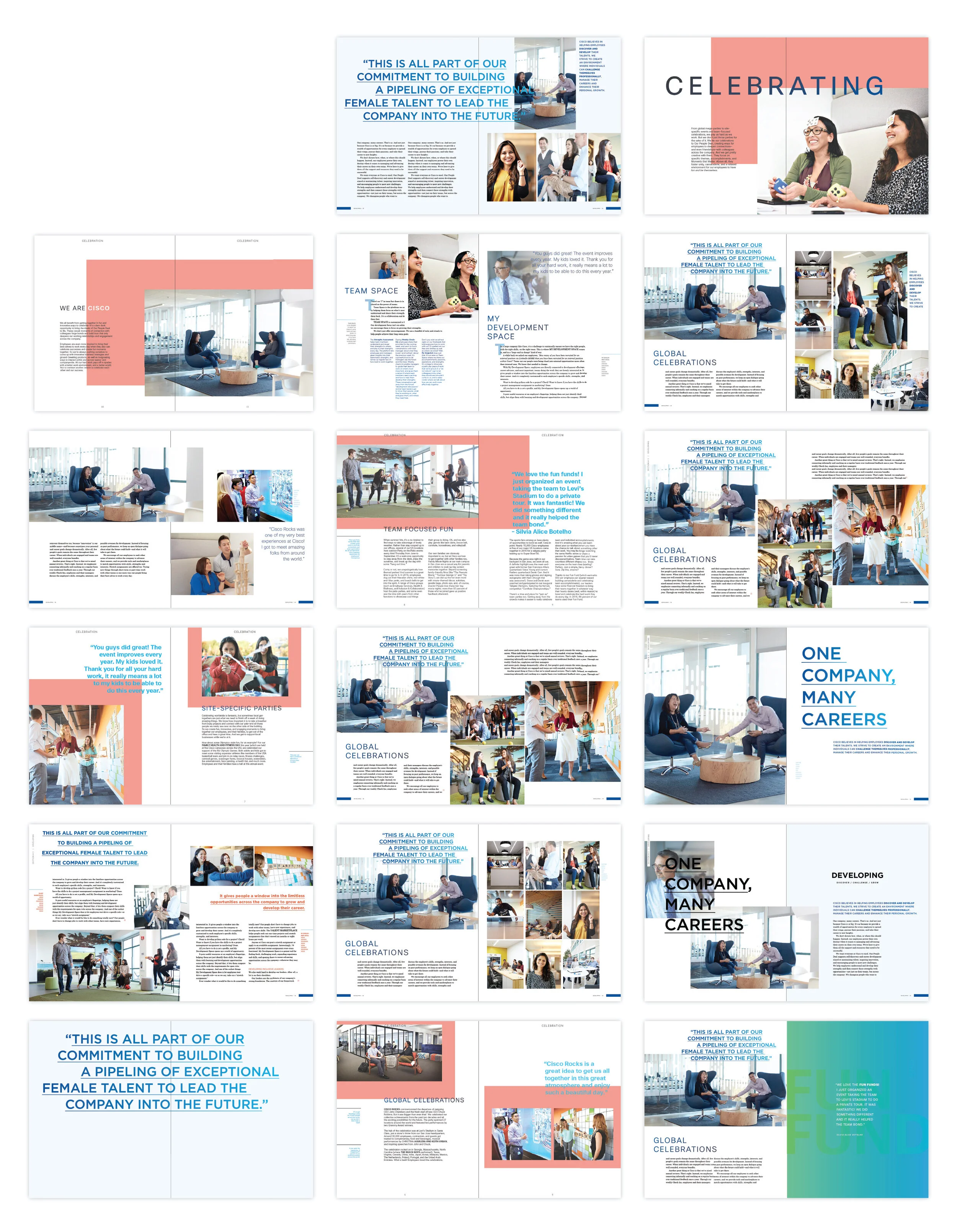
Cisco appreciated each design and asked to see some elements of each put together into a final iteration, which resulted in what we called the mash-up, seen above. While some additional rounds of changes resulted in the final design, the overall process of delivering designed concepts to the client was a success. They were delighted with both the design process experience and the final product.